Project 1 required us to create a personal brand logo for ourselves. This process involved many steps and critiques and we ended up with one final successful logo for ourselves. Here is my process:
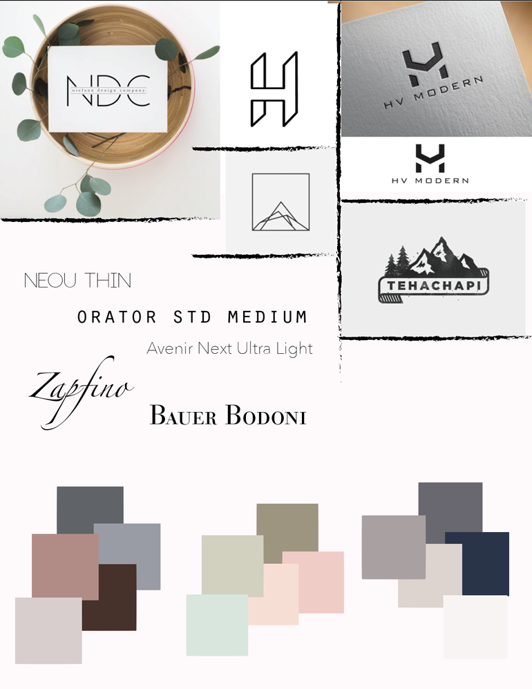
- The beginning of this project started out with creating a moodboard to gather our inspiration for colors, text, and overall style and feel.
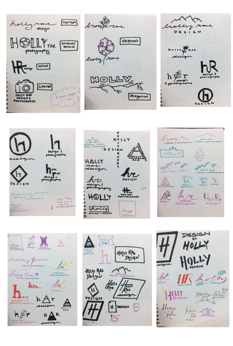
2.Logo Sketches: We continued this process by sketching out ideas for our logo beginning with the 6 categories of logos; logotype, product/service, initial, literal, abstract, and allegorical. From there, I continued to sketch 80 total logo ideas and narrowed them down from there.
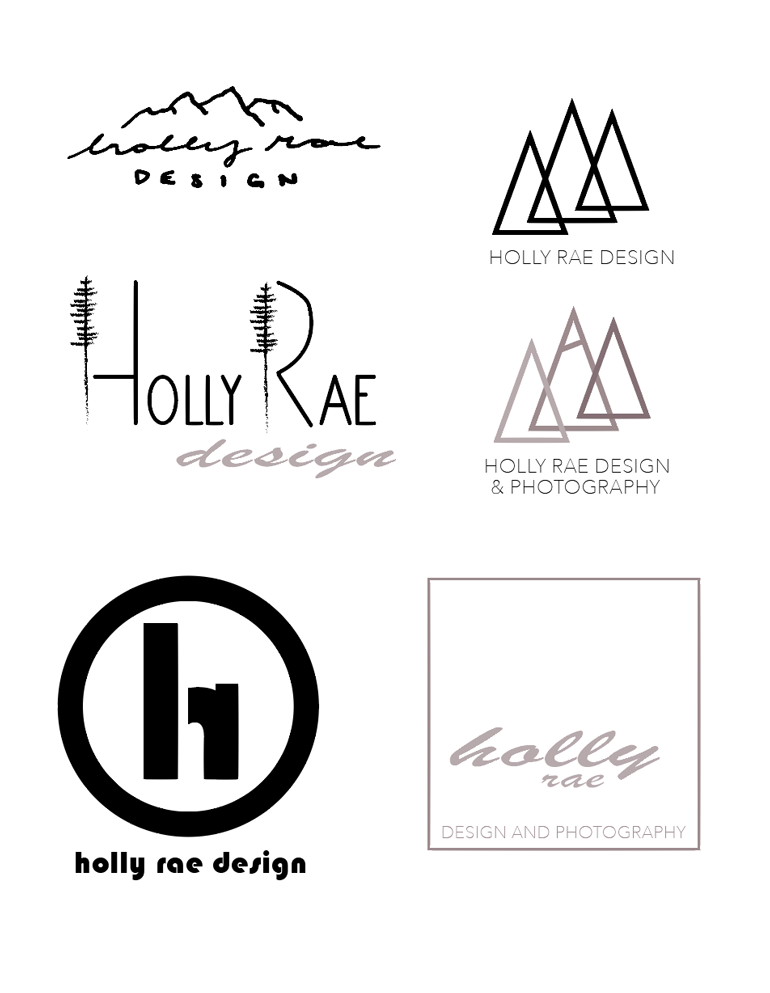
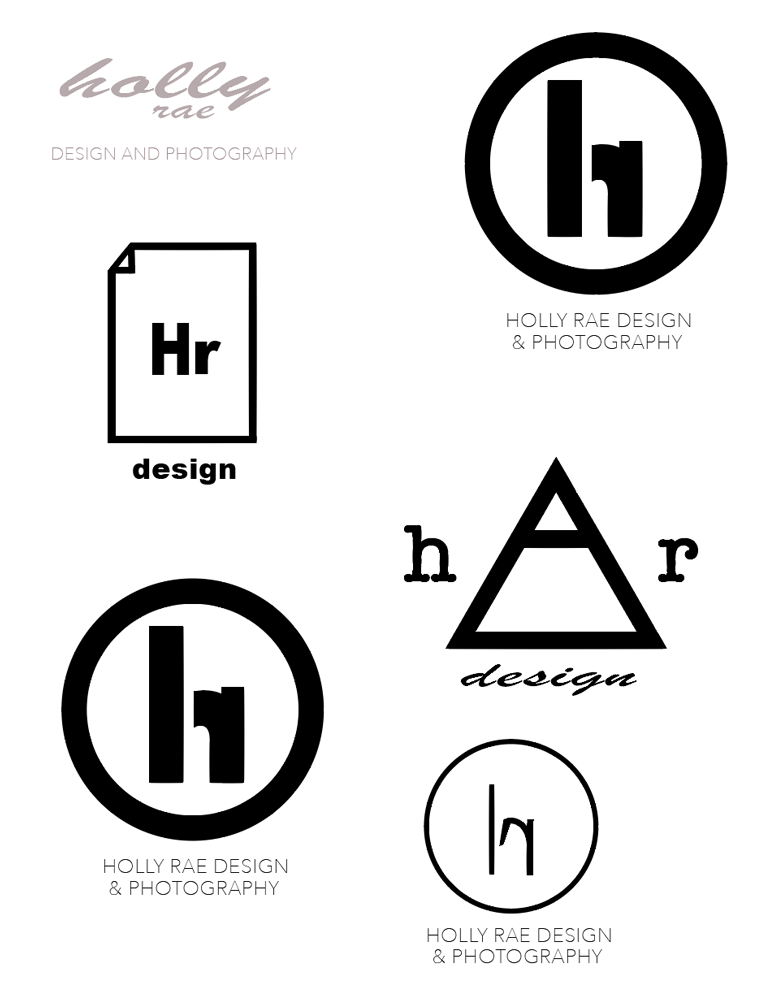
3. From here, I narrowed it down to fewer, more developed logos brought into illustrator and converted them into vector images. This allowed me to play with color and size and strokes, etc. to get a better feel for what my logos' potential could be.
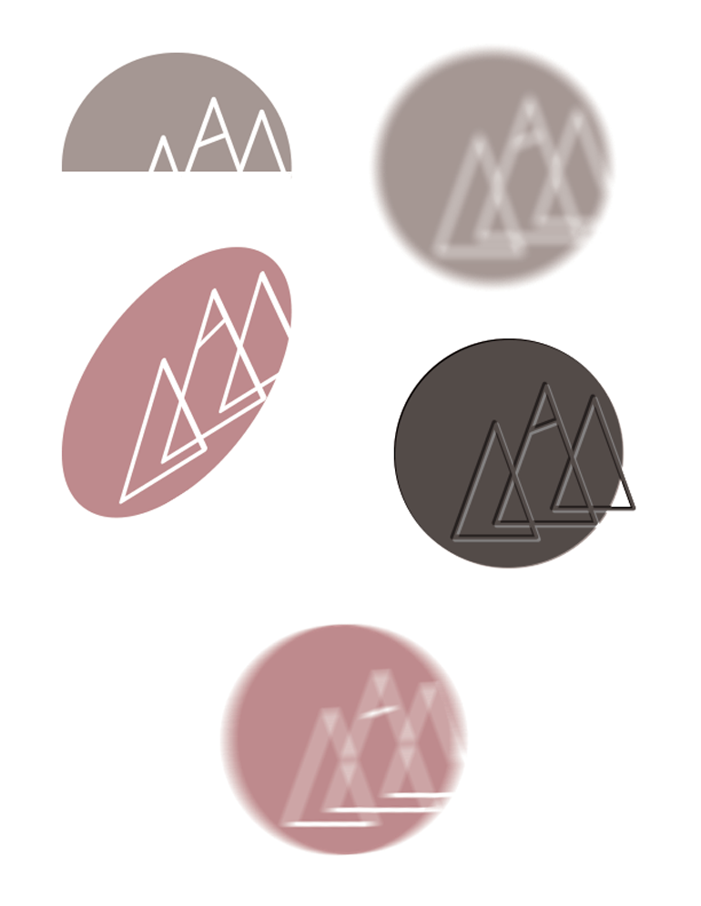
4. When I chose a final logo, I tested whether it could withstand various effects added to it to mimic possible situations it may be exposed to such as motion blur when a car drives by, embossing, distorting it as if it were flying on a flag or on a shirt, etc.
5. After critiquing each of my semi-finalized logos, I decided on one of them for my personal brand use and continued to tweak it until I felt it had reached its full potential. I played around with the color, stroke weight, rounding corners, and a pantone color scheme. This is my final brand board featuring the logo in color, black and white, the pantone color used, and a typeface choice if I choose to add a title. 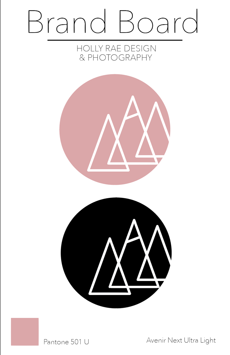
No comments.